Bar diagram is the graphical representation of data, more specifically, it includes bars that allow for the comparison of data among different categories. There are two axes, the horizontal one also known as the x-axis, and the vertical one also known as the y-axis. These diagrams show the relationship between the two axes. Broadly speaking, bar diagrams are categorized into four types: vertical, horizontal, stacked, and grouped. Even though the bar diagram permits the visual representation of data, it requires additional explanation. This will bring us to the advantages and disadvantages of the bar diagram shortly.
The use of bar diagrams
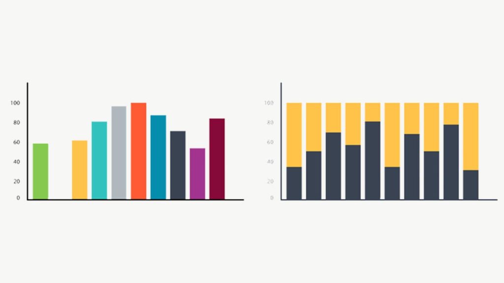
For now, know that the vertical bar diagram is used to define the series of data over time. The horizontal one is utilized to include the long label along the vertical axis. In vertical bar diagrams, there is little space at the bottom for including long labels. In the stacked bar diagram, the total values across various categories are compared at the same time. Lastly, the grouped bar diagram shows the discrete value for two or more categorical data.
Advantages of a bar diagram
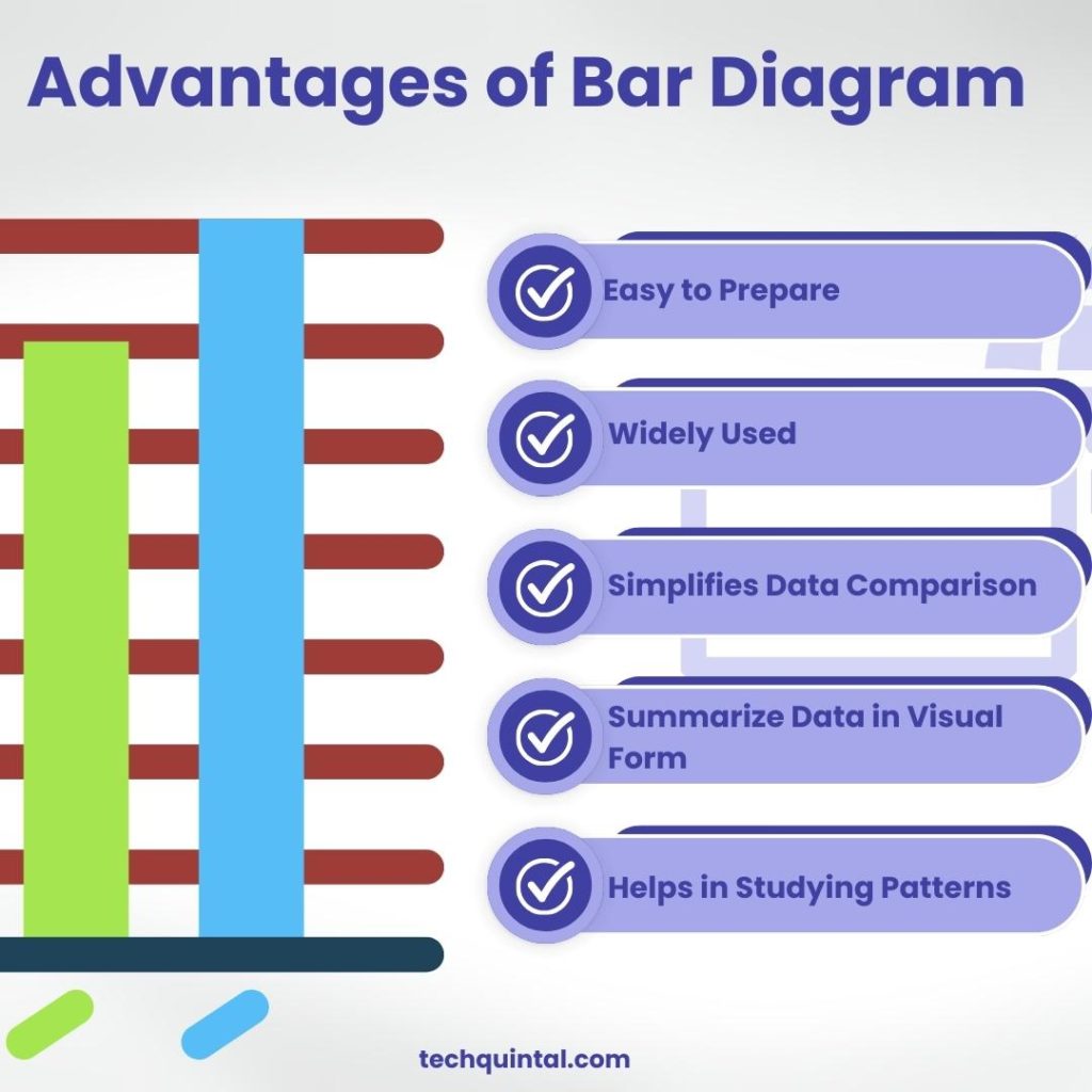
Bar diagrams are used in various industries as they are easily accessible and ideal for visual data representation. Some other benefits are as follows:
1. It is easy to prepare
Bar diagram is easy to design both on paper and in computer software. All you need is the required data for comparison before selecting the type of bar diagram. For a few categories, the vertical bar diagram works perfectly. For multiple categories, the horizontal bar diagram is more suitable.
Furthermore, you can select a stacked bar diagram to break up categories into segments or a grouped bar diagram for representing data over time. The x-axis and y-axis can be easily labeled, and the bars can be drawn to corresponding values. For this reason, the bar diagram is the popular choice for visual data presentation.
2. Bar diagrams are widely used
The bar diagram is used in various fields across the globe. For instance, it has applications in epidemiology for understanding the spread of diseases and controlling them. Businesses widely use bar diagrams for analyzing sales and finances. Furthermore, it can also be employed for tracking personal finances.
3. It simplifies data comparison
Bar graph has multiple types suitable for accurate visual data representation. This streamlines the comparison processes. For instance, to compare the sales of products for an online and an offline store across different months, the stacked bar diagram can be used.
The bar itself conveys the sales of online as well as offline stores each month. This helps businesses compare how well each of their stores is performing and where they need to focus their attention.
4. Bar diagrams summarize large data sets in visual form
The large data set is outlined using a bar diagram. This is because it makes the analysis process simpler and fun. The graphical representation of the data set gives a better sense of the data to be analyzed. Plus, there are spaces between bars that emphasize individual bars represent discrete values.
For instance, a business wants to understand the delivery time and status of on-peak and off-peak hours. The grouped bar diagram can be used to summarize the data in visual form and analyze the areas that need improvement.
5. It helps in studying patterns
The bar diagram visually represents data that changes over time, which helps in pattern and trend identification. Compare this with a table of numerical data, and you will realize employing a bar diagram gets the job done more easily.
While you would need an expert to recognize patterns from a table of numerical data, with a bar diagram even the beginner can read the label and recognize patterns and trends. That’s how easy the visual representation of data with a bar diagram makes studying patterns and highlighting trends.
Disadvantages of a bar diagram
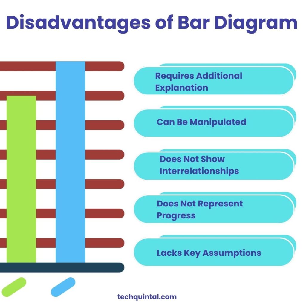
Bar diagrams cannot be used for judging the impact of unexpected events, making them unsuitable for large projects. The following are other downsides of a bar diagram:
1. It requires additional explanation
Bar diagrams are widely utilized in presentations for representing data visually. But oftentimes, only using the bar diagram is not enough. Even though labels along both axes explain the represented data, for clarity purposes, a further illustration is needed. That’s the drawback of a bar diagram, especially when you are representing complex data sets. Relying only on the bar diagram to explain the data set is not sufficient.
2. Bar diagrams can be manipulated
In the digital times we live in, more and more people prefer a visual representation of content. That’s when the bar diagram comes into the picture. But sadly, considering how easily accessible it is and how quickly it can be shared across social media, its misuse is bound to happen.
In recent times, bar diagrams have been manipulated in several ways. A few of these ways are omitting the baseline, manipulating the y-axis, and messing with the standard. All these bad practices are carried out to mislead and manipulate readers.
3. It does not show interrelationships
While a bar diagram can be used to calculate the work and time required for various activities in the project, unfortunately, it doesn’t showcase the interrelationship between these activities. Therefore, it cannot be used as a controlling tool. Since the relationship between these actions cannot be represented, using the bar diagram for managing projects becomes difficult.
4. The bar diagram does not represent the progress
A bar graph facilitates a systematic representation and arrangement of different activities in a project. But when it comes to monitoring the progress of these activities, the bar diagram cannot depict them. This makes it an undesirable tool as we live in a dynamic world where we need to take timely actions. Additionally, it makes detecting delays in activities difficult.
5. It lacks key assumptions, causes, and impact
As we have mentioned earlier, bar diagrams require additional explanation to allow readers to easily understand them. Similarly, the bar diagram lacks fundamental causes, impact, and assumptions essential for analyzing data. Although you can represent the large data set in a visual and interpretable form, the bar diagram is suitable for small projects.
Which type of diagram to use?
You might be wondering what type of diagram to use for your next presentation or project. While bar diagrams suit most purposes, you can also use other types of diagrams/graphs. The below table compares different types of diagrams, their purposes, and uses:
| Diagram Type | Purpose | Best Used For (Examples) |
|---|---|---|
| Bar Graph | To compare quantities or frequencies across different categories | Comparing sales data from different quarters, comparing populations of different countries |
| Pie Chart | To show the proportion of the whole that each category represents | Showing budget allocations, understanding market share |
| Line Graph | To display trends over time | Tracking stock prices over time, showing temperature changes over a year |
| Flowchart | To illustrate the sequence of steps in a process | Explaining the steps in a manufacturing process, illustrating software algorithms |